Table of Contents
21 December 2020
Reading Time: 6 Minutes
Introduction
A picture, so they say, will tell a thousand words. But what about a graph or chart?
A useful graph or chart can show as many as several paragraphs of words. But how do you choose which style of graph to use?
There are several types of graphics. The choice depends on the type of data collected and the information you want to transmit. Each has a set of advantages and disadvantages. The following table summarizes the main types of graphs available. The knowledge of each one of them is fundamental for a correct reading of the information they contain.
Downloadable PDF
If you ever want to read it again as many times as you want, here is a downloadable PDF to explore more.
| 📥 | What are the types of graphs in maths and statistics? |
What is a Bar graph?
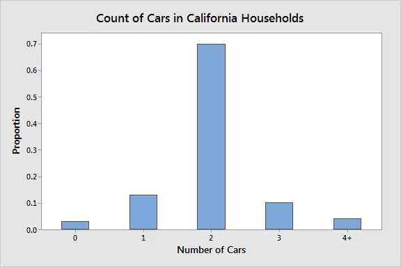
A Pareto diagram or bar graph is a way to represent qualitative data visually. Data is displayed either horizontally or vertically and allows viewers to compare items, such as amounts, characteristics, times, and frequency. The bars are arranged in order of frequency, so more important categories are emphasized. By looking at all the bars, it is easy to tell which categories in a set of data dominate the others. Bar graphs can be either single, stacked, or grouped.
Vilfredo Pareto developed the bar graph when he sought to give economic decision-making a more "human" face by plotting data on graph paper, with income on one axis and the number of people at different income levels on the other. The results were striking: They showed dramatically the disparity between rich and poor in each era over centuries.
What is a Pie Chart?
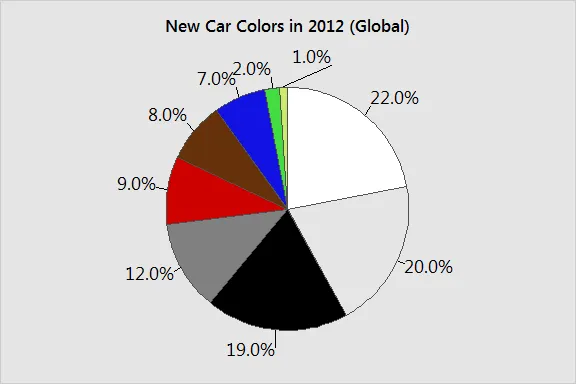
Another common way to represent data graphically is a pie chart. It gets its name from the way it looks, just like a circular pie that has been cut into several slices. This kind of graph is helpful when graphing qualitative data, where the information describes a trait or attribute and is not numerical.
Each slice of pie represents a different category, and each trait corresponds to a different slice of the pie; some slices usually noticeably larger than others. By looking at all of the pie pieces, you can compare how much of the data fits each category, or slice.
What is known as a histogram?
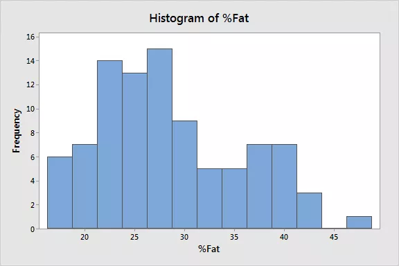
A histogram is another kind of graph that uses bars in its display. This type of graph is used with quantitative data. Ranges of values, called classes, are listed at the bottom, and the classes with greater frequencies have taller bars.
A histogram often looks similar to a bar graph, but they are different because of the level of measurement of the data. Bar graphs measure the frequency of categorical data. A categorical variable is one that has two or more categories, such as gender or hair color. Histograms, by contrast, are used for data that involve ordinal variables, or things that are not easily quantified, like feelings or opinions.
What are Stem and Leaf Plots?
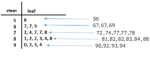
A stem and leaf plot breaks each value of a quantitative data set into two pieces: a stem, typically for the highest place value, and a leaf for the other place values. It provides a way to list all data values in a compact form. For example, if you are using this graph to review student test scores of 84, 65, 78, 75, 89, 90, 88, 83, 72, 91, and 90, the stems would be 6, 7, 8, and 9, corresponding to the tens place of the data. The leaves—the numbers to the right of a solid line—would be 0, 0, 1 next to the 9; 3, 4, 8, 9 next to the 8; 2, 5, 8 next to the 7; and, 2 next to the 6.
This would show you that four students scored in the 90th percentile, three students in the 80th percentile, two in the 70th, and only one in the 60th. You'd even be able to see how well students in each percentile performed, making this a good graph to understand how well students comprehend the material.
What is a Dot Plot
A dot plot is a hybrid between a histogram and a stem and leaf plot. Each quantitative data value becomes a dot or point that is placed above the appropriate class values. Where histograms use rectangles—or bars—these graphs use dots, which are then joined together with a simple line, says statisticshowto.com.
Dot plots provide a good way to compare how long it takes a group of six or seven individuals to make breakfast, for example, or to show the percentage of people in various countries who have access to electricity.
What are Scatter Plots?
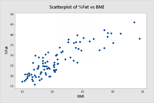
A scatterplot displays data that is paired by using a horizontal axis (the x-axis) and a vertical axis (the y-axis). The statistical tools of correlation and regression are then used to show trends on the scatterplot. A scatterplot usually looks like a line or curve moving up or down from left to right along the graph with points "scattered" along the line. The scatterplot helps you uncover more information about any data set, including:
- The overall trend among variables (You can quickly see if the trend is upward or downward.)
- Outliers from the overall trend.
- The shape of any trend.
- The strength of any trend.
What are Time-Series Graphs?
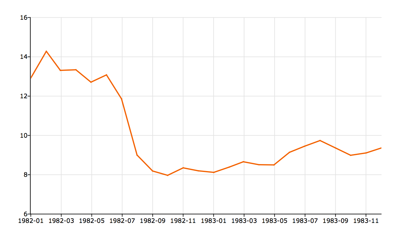
A time-series graph displays data at different points in time, so it is another kind of graph to be used for certain kinds of paired data. As the name implies, this type of graph measures trends over time, but the timeframe can be minutes, hours, days, months, years, decades, or centuries. For example, you might use this type of graph to plot the United States population over a century. The y-axis would list the growing population, while the x-axis would list the years, such as 1900, 1950, 2000.
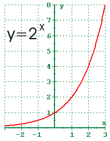
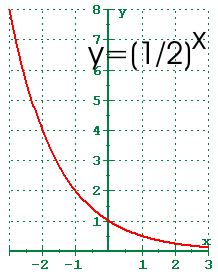
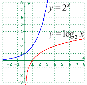
What are Exponential Graphs?
Exponential graphs are the representation of exponential functions using the table of values and plotting the points on a graph paper. It should be noted that the exponential functions are the inverse of logarithmic functions.
In the case of exponential charts, the graph can be an increasing or decreasing type of curve based on the function. An example is given below, which will help to understand the concept of graphing exponential function easily.
For example, the graph of y = 2x is an increasing one, while the graph of y = 2-x is a decreasing one.
Graph of y = 2x:
Graph of y = 2-x = (½)x
What are Logarithmic Graphs?
Logarithmic functions are inverse of exponential functions, and the method of plotting them is similar. To plot logarithmic graphs, it is required to make a table of values and then plot the points accordingly on a graph paper.
The graph of any log function will be the inverse of an exponential function. An example is given below for better understanding.
For example, the inverse graph of y = 2x will be y = log2x which will be as follows:
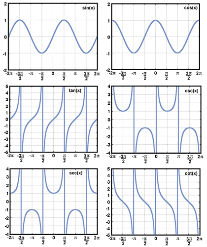
What are Trigonometric Graphs?
Trigonometry graphs are plotted below for the 6 trigonometric functions, including sine function, cosine function, tangent function, cotangent function, cosec function, and sec function.
What is a Frequency Distribution Graph?
A frequency distribution graph is used to show the frequency of the outcomes in a particular sample. For frequency distribution graphs, the table of values made by placing the outcomes in one column and the number of times they appear (i.e., frequency) in the other column. This table is known as the frequency distribution table from which the cumulative frequency graph or ogive can be plotted.
Summary
In the field of statistics, data are vital. Data are the information that you collect to learn, conclude, and test hypotheses. After all, statistics is the science of learning from data. However, there are different types of variables, and they record various kinds of information.
Crucially, the type of data determines what you can learn from it, and, importantly, what you cannot learn from it. Consequently, you must understand the different types of data. So, you understand the different types of data, what you can learn from them, and how to graph them—How else can you use this knowledge?
In statistics, the kind of variable greatly determines which kinds of analyses you can perform.
About Cuemath
Cuemath, a student-friendly mathematics and coding platform, conducts regular Online Classes for academics and skill-development, and their Mental Math App, on both iOS and Android, is a one-stop solution for kids to develop multiple skills. Understand the Cuemath Fee structure and sign up for a free trial.
Frequently Asked Questions (FAQs)
What are graphs in statistics?
A statistical graph or chart is defined as the pictorial representation of statistical data in graphical form. The statistical graphs are used to represent a set of data to make it easier to understand and interpret statistical information.
What are the four main types of graphs?
Three types of graphs are used in this course:
- line graphs,
- pie graphs
- bar graphs.
Where are graphs used in real life?
Graphs are used in everyday life, from the local newspaper to the magazine stand. It is one of those skills that you simply cannot do without. Whatever your need or calculation, if used correctly, a graph can help you and make your life simpler.