visual curriculum
Table of Contents
| 1. | Introduction |
| 2. | Types of Graphical Representation |
| 3. | Bar Graphs & its types |
| 4. | LineGraphs & its types |
| 5. | Applications in Real Life |
| 6. | Summary |
| 7. | FAQs |
28 October 2020
Read time: 5 minutes
Introduction
The purpose of a graph is to show a representation of numerical facts in visual form so that they can be understood quickly, easily, and clearly. Thus, graphs are visual representations of the collected data; they are also more effective for comparing. Data can also be presented in the form of a table; however, a graphical representation is easier to understand and can be presented more creatively.
So in this article, we will understand graphs, types of representing data, and the applications in real life.
Types Of Graphical Presentations
Following are the different types of graphical representations:
- Line graphs
- Bar Graphs
- Pictographs
- Pie-Charts
- Frequency Diagrams and Polygons
- Scatter Diagrams
Line Graphs: A line graph compares two variables through visual representation, shown on the x- and y-axis. It shows the information through a continuous line drawn between all the points on a grid.

Line Graph will be discussed in detail below.
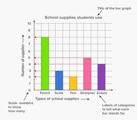
Bar Graphs: To show a comparison between different categories, we can use a Bar Graph. It consists of two or more parallel vertical (or horizontal) bars (rectangles).e.g. between two grades, two companies, etc.
We will see bar graphs in detail further.
Pictographs: A pictograph conveys statistical information through pictures and symbols. One should carefully use a pictograph because the graphs may, either accidentally or deliberately, misrepresent the data. That is why this type of graph should be visually accurate.
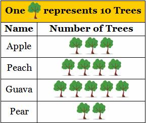
It helps in expressing a large amount of data in a more straightforward form. Further, the symbols in a pictograph help attract attention and are a smart way of representing data. In fact, they are relatively easy to read since we can get all the information in one glimpse and do not need a great deal of explanation.
Pie Charts: Pie charts are circular charts divided into sectors according to the value they represent. The arc length of each sector is proportional to the quantity it represents.
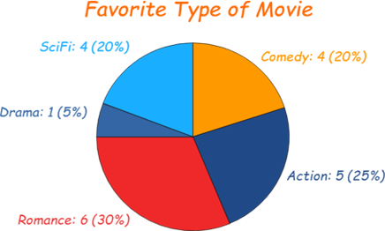
We generally use pie charts to show percentage or proportional data. Usually, the percentage represented by each category is provided next to the corresponding sector of the circle. In a pie chart, the angle of each sector represents the fraction, out of 360 degrees, of that data value. We should always label them, either directly on the pie chart or by using a color-coded key.
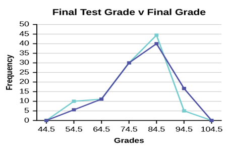
Frequency Diagrams And Polygon: A frequency diagram, which is also called a line chart or a frequency polygon, shows the frequencies of different groups. A frequency polygon is a graphical device that helps in understanding the shapes of distributions. Although they serve the same purpose as histograms, they are also helpful for comparing sets of data. This is also a good choice for displaying cumulative frequency distributions. It is used to measure/analyze how frequently a particular observation occurs. It might be marks of a student per year for a few years, runs, etc.
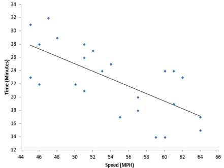
Scatter Diagrams: A scatter diagram is a tool for comparing relationships between two variables for determining how closely the two variables are related. It is also called a Scatter Graph or Correlation Chart. In Scatter Graph, One variable is plotted on the horizontal axis, and the other is plotted on the vertical axis. Where there is less scatter that is about the best-fit line, the stronger the relationship is between the two quantities. If the points are close to the best-fit line, we say that there is a strong correlation. If the points are loosely scattered, there is a weak correlation. There is zero correlation if there is no linear relationship between the variables- in other words, if we can't draw a meaningful best fit line. If the best fit line slopes upward like it does below, then the things we are comparing go up together. We say that there is a positive correlation. If the line slopes down, the 'dependent variable' decreases as the 'independent variable' increases.
Bar Graphs and Its Types
A bar graph is used to show a comparison among categories. It may consist of two or more parallel vertical (or horizontal) bars (rectangles). A bar chart is used to compare two or more values with a small set of results.
Properties of Bar Graphs
- Every bar or column in a bar graph is of equal width.
- All bars have a common base.
- The height of the bar corresponds with the value of the data.
- The distance between each consecutive pair of bars is the same.
Construction of a Bar Graph
- Draw two perpendicular lines that intersect each other at a point O. Name the vertical line as y-axis and the horizontal as x-axis.
- Choose a suitable scale to determine the height of each bar.
- Draw the bars at equal distance, with corresponding heights on the horizontal line.
- The space between the bars should be equal.
Types of Bar Graphs
There are two types of Bar Graphs:
- A vertical Bar Graph
- A horizontal Bar Graph
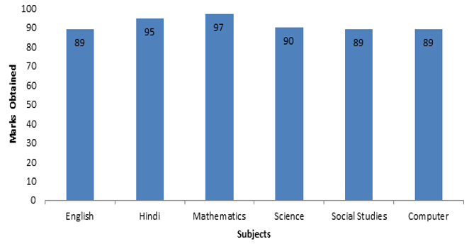
Depending upon the choice of the axis as the base either Vertical Bar Graph or Horizontal Bar Graphs are used. Let us take an example of a bar graph showing the comparison of marks of a student in all subjects out of 100 marks.
With the bar graph, we can also compare the marks of students in each subject other than the marks of one student in every subject. Also, we can draw the bar graph for every student in all subjects.
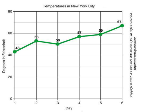
Line graphs and its types
Data that changes continuously over periods of time is displayed by a line graph. A line graph is often used to show a trend over a number of days or hours. It shows the changes in the data over a period of time. We plot a line graph as a series of points, which are then joined with straight lines. It is not necessary that the ends of the line graph have to join the axis.
Properties of a line graph
- It consists of vertical and horizontal scales. These scales may or may not be uniform.
- The data points correspond to the change over a period of time.
- The line joining these data points shows the trend of change.
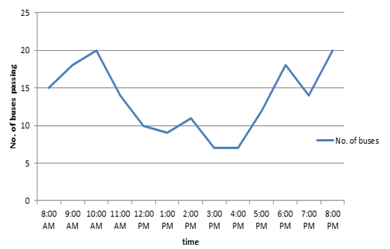
For example, the line graph showing the number of buses passing through a particular street over a period of time can be represented as follows:
Types of Line Graphs
The following are the types of line graph. They are:
- Simple Line Graph: Only one line is plotted on the graph.
- Multiple Line Graph: More than one line is plotted on the same set of axes. A multiple line graph is used to effectively compare similar items over the same period of time.
- Compound Line Graph: If information can be subdivided into two or more types of data. This type of line graph is called a compound line graph. Lines are drawn to show the component part of a total. The top line shows the total and the line below shows part of the total. The distance between every two lines shows the size of each part.
One important use of line graphs is to track the changes over a short and long period of time. It is also used to compare the changes over the same period of time for different groups. If small changes exist in the data, it is always better to use the line graph than the bar graph. For example, a company finance team wants to plot the changes in the cash amount that the company has on hand over time. In this case, they use a line graph and plot the points over the horizontal and vertical axes. It usually represents the time period of the data.
Applications in Real Life
In real life, you might have observed that if you use more of a facility, you have to pay more for it. If more electricity is consumed, the bill is bound to be high. If you use less electricity, then the bill will be lesser. This instance is an example of a situation where one quantity affects another. The amount of electricity bill depends on the quantity of electricity used. We can say that here, the quantity of electricity is an independent variable (or sometimes controllable variable) and the amount of electricity bill is the dependent variable. A graph represents the relation between such variables.
Summary
The graphical presentation of data is much easier to understand than numbers. A graph shows the relation between a dependent variable and an independent variable. A bar graph shows a comparison among categories. A pie chart is used to represent and compare parts of a whole. A bar graph that shows data in intervals is called a histogram. A line graph is used to display data that changes continuously over periods of time. A line graph which is a whole unbroken line is called a linear graph. For locating a point on the graph sheet we need the x-coordinate and y-coordinate of the point.
Frequently Asked Questions (FAQs)
What is data?
Data is a collection of facts, such as numbers, words, measurements, observations or just descriptions of things. Qualitative vs Quantitative.
How do you differentiate between data and information?
Information is a processed, organized data presented in a given context and is useful to humans. Data is an individual unit that contains raw material that does not carry any specific meaning. Information is a group of data that collectively carries a logical meaning.
What are the ways to represent data?
Tables, charts, and graphs are all ways of representing data, and they can be used for two broad purposes. The first is to support the collection, organization, and analysis of data as part of the process of a scientific study.
What are the different types of graphs?
The following are the different types of Graphs used for Data Representation.
- Line graphs
- Bar Graphs
- Pictographs
- Pie-Charts
- Frequency Diagrams and Polygons
- Scatter Diagrams
What are the different types of bar graphs?
A bar graph can be either vertical or horizontal depending upon the choice of the axis as the base.
What are the different types of line graphs?
The Different Types of Line Graphs are:
- Simple Line Graph
- Multiple Line Graph
- Compound Line Graph
What are graphs ? Also give an Example of a type of graph.
A graph refers to a diagram that is used to represent data, comparing data, etc. Examples of graphs are Line Graph, Bar Graph, a Pie Chart, etc.
Line chart example: