visual curriculum
Table of Contents
15 December 2020
Read time: 6 minutes
Introduction
What are graphs?
What are the different types of data?
What are the different types of graphical representations?
The graph is nothing but an organized representation of data. It helps us to understand the data. Data are the numerical information collected through observation.
The word data came from the Latin word Datum which means “something given”
After a research question is developed, data is being collected continuously through observation. Then it is organized, summarized, classified, and then represented graphically.
Differences between Data and information: Data is the raw fact without any add on but the information is the meaning derived from data.
|
Data |
Information |
|---|---|
|
Raw facts of things |
Data with exact meaning |
|
No contextual meaning |
Processed data and organized context |
|
Just numbers and text |
Introduction to Graphs-PDF
The graph is nothing but an organized representation of data. It helps us to understand the data. Data are the numerical information collected through observation. Here is a downloadable PDF to explore more.
| 📥 | Introduction to Graphs-PDF |
Also read:
What are the different Types of Data?
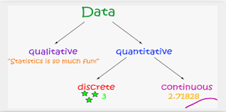
There are two types of Data :

Quantitative
The data which are statistical or numerical are known as Quantitive data. Quantitive data is generated through. Quantitative data is also known as Structured data. Experiments, Tests, Surveys, Market Report.
Quantitive data is again divided into Continuous data and Discrete data.
Continuous Data
Continuous data is the data which can have any value. That means Continuous data can give infinite outcomes so it should be grouped before representing on a graph.
Examples
- The speed of a vehicle as it passes a checkpoint
- The mass of a cooking apple
- The time taken by a volunteer to perform a task
Discrete Data
Discrete data can have certain values. That means only a finite number can be categorized as discrete data.
- Numbers of cars sold at a dealership during a given month
- Number of houses in certain block
- Number of fish caught on a fishing trip
- Number of complaints received at the office of airline on a given day
- Number of customers who visit at bank during any given hour
- Number of heads obtained in three tosses of a coin
Differences between Discrete and Continuous data
- Numerical data could be either discrete or continuous
- Continuous data can take any numerical value (within a range); For example, weight, height, etc.
- There can be an infinite number of possible values in continuous data
- Discrete data can take only certain values by finite ‘jumps’, i.e., it ‘jumps’ from one value to another but does not take any intermediate value between them (For example, number of students in the class)
Qualitative
Data that deals with description or quality instead of numbers are known as Quantitative data. Qualitative data is also known as unstructured data. Because this type of data is loosely compact and can’t be analyzed conventionally.
Different Types of Graphical Representations
There are many types of graph we can use to represent data. They are as follows,
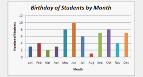
Bar graph
A bar graph or chart is a way to represent data by rectangular column or bar. The heights or length of the bar is proportional to the values.
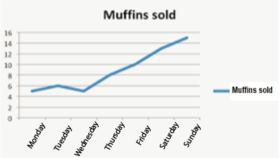
Line graph
A line graph is a type of graph where the information or data is plotted as some dots which are known as markers and then they are added to each other by a straight line.
The line graph is normally used to represent the data that changes over time.
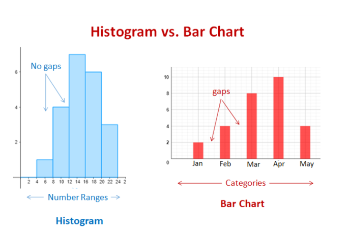
Histogram
A histogram graph is a graph where the information is represented along with the height of the rectangular bar. Though it does look like a bar graph, there is a fundamental difference between them. With the histogram, each column represents a range of quantitative data when a bar graph represents categorical variables.
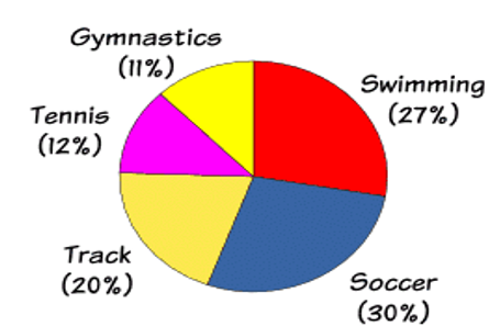
Pie chart
The other name of the pie chart is a circle graph. It is a circular chart where numerical information represents as slices or in fractional form or percentage where the whole circle is 100%.
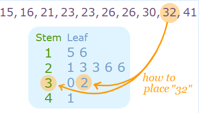
Stem and leaf plot
The stem and leaf plot is a way to represents quantitative data according to frequency ranges or frequency distribution.
In the stem and leaf plot, each data is split into stem and leaf, which is 32 will be split into 3 stems and 2 leaves.
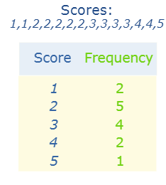
Frequency table: Frequency means the number of occurrences of an event. A frequency distribution table is a graph or chart which shows the frequency of events. It is denoted as ‘f’.
Pictograph
Pictograph or Pictogram is the earliest way to represents data in a pictorial form or by using symbols or images. And each image represents a particular number of things.
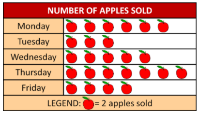
According to the above-mentioned Pictograph, the number of Appels sold on Monday is 6x2=12.
Scatter diagrams
Scatter diagram or scatter plot is a way of graphical representation by using cartesian coordinates of two variables. The plot shows the relationship between two variables. Below there is a data table as well as a Scattergram as per the given data.
| Ice cream sales vs Temperature | |
|---|---|
| Temperature ºc | Ice cream sales |
| 14.2º | $215 |
| 16.4º | $325 |
| 11.9º | $185 |
| 15.2º | $332 |
| 18.5º | $406 |
| 22.1º | $522 |
| 19.4º | $412 |
| 25.1º | $614 |

What is the meaning of Graphical representation?
Graphical representation is a way to represent and analyze quantitive data. A graph is a kind of a chart where data are plotted as variables across the coordinate. It became easy to analyze the extent of change of one variable based on the change of other variables.
Principles of graphical representation
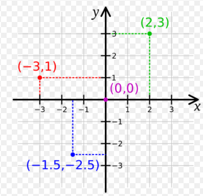
The principles of graphical representation are algebraic. In a graph, there are two lines known as Axis or Coordinate axis. These are the X-axis and Y-axis. The horizontal axis is the X-axis and the vertical axis is the Y-axis. They are perpendicular to each other and intersect at O or point of Origin.
On the right side of the Origin, the Xaxis has a positive value and on the left side, it has a negative value. In the same way, the upper side of the Origin Y-axis has a positive value where the down one is with a negative value.
When X-axis and y-axis intersected each other at the origin it divides the plane into four parts which are called Quadrant I, Quadrant II, Quadrant III, Quadrant IV.
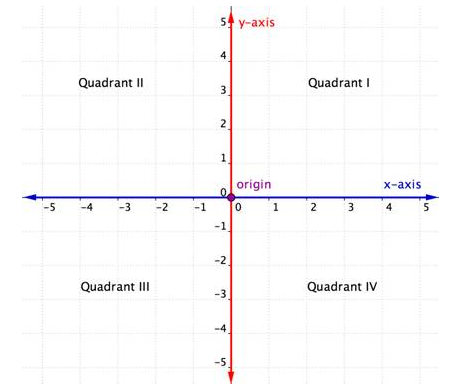
The location on the coordinate plane is known as the ordered pair and it is written as (x,y). That means the first value will be on the x-axis and the second one is on the y-axis. When we will plot any coordinate, we always have to start counting from the origin and have to move along the x-axis, if it is positive then to the right side, and if it is negative then to the left side. Then from the x-axis, we have to plot the y’s value, which means we have to move up for positive value or down if the value is negative along with the y-axis.
In the following graph, 1st ordered pair (2,3) where both the values of x and y are positive and it is on quadrant I. 2nd ordered pair (-3,1), here the value of x is negative and value of y is positive and it is in quadrant II. 3rd ordered pair (-1.5, -2.5), here the value of x as well as y both are Negative and in quadrant III.
Methods of representing a frequency distribution
There are four methods to represent a frequency distribution graphically. These are,
- Smoothed Frequency graph
- Histogram
- Cumulative frequency graph or Ogive.
- Pie diagram.
Advantages and Disadvantages of Graphical representation of data
- It improves the way of analyzing and learning as the graphical representation makes the data easy to understand.
- It can be used in almost all fields from mathematics to physics to psychology and so on.
- It is easy to understand for its visual impacts.
- It shows the whole and huge data in an instance.
The main disadvantage of graphical representation of data is that it takes a lot of effort as well as resources to find the most appropriate data and then represents it graphically.
You may also like:
Summary
Not only in mathematics but almost in every field the graph is a very important way to store, analyze, and represents information. After any research work or after any survey the next step is to organize the observation or information and plotting them on a graph paper or plane. The visual representation of information makes the understanding of crucial components or trends easier.
A huge amount of data can be store or analyze in a small space.
The graphical representation of data helps to decide by following the trend.
A complete Idea: Graphical representation constitutes a clear and comprehensive idea in the minds of the audience. Reading a large number (say hundreds) of pages may not help to make a decision. Anyone can get a clear idea just by looking into the graph or design.
Graphs are a very conceptual topic, so it is essential to get a complete understanding of the concept. Graphs are great visual aids and help explain numerous things better, they are important in everyday life. Get better at graphs with us, sign up for a free trial.
About Cuemath
Cuemath, a student-friendly mathematics and coding platform, conducts regular Online Classes for academics and skill-development, and their Mental Math App, on both iOS and Android, is a one-stop solution for kids to develop multiple skills. Understand the Cuemath Fee structure and sign up for a free trial.
Frequently Asked Questions (FAQs)
What is data?
Data are characteristics or information, usually numerical, that are collected through observation.
How do you differentiate between data and information?
Data is the raw fact without any add on but the information is the meaning derived from data.
|
Data |
Information |
|---|---|
|
Raw facts of things |
Data with exact meaning |
|
No contextual meaning |
Processed data and organized context |
|
Just numbers and text |
What are the types of data?
There are two types of Data:
What are the ways to represent data?
Tables, charts and graphs are all ways of representing data, and they can be used for two broad purposes. The first is to support the collection, organisation and analysis of data as part of the process of a scientific study.
What are the ways to represent data?
- Tables, charts and graphs are all ways of representing data, and they can be used for two broad purposes. The first is to support the collection, organisation and analysis of data as part of the process of a scientific study.
What are the different types of graphs?
Different types of graphs include:
- Bar graph
- Line graph
- Histogram
- Pie chart
- Stem and leaf plot
- Pictograph
- Scatter diagrams