visual curriculum
Table of Contents
| 1. | Introduction |
| 2. | Types of graphs and charts |
| 3. | Summary |
| 4. | FAQs |
17 December 2020
Reading Time: 7 Minutes
Introduction
Have you heard the phrase 'A picture tells a thousand words'?
90% of the knowledge sent to the brain is visual and over 90% of all human communication is visual.
Processing text requires our brains to figure much harder than when processing images.
It's often much easier to use an image than to explain numerical information in words.
The data itself could also be vitally important, but without a visible presentation of that data, its impact (and therefore your message) could also be lost.
When you collect and record data, you should represent it with the help of a diagram.
To point out the results, you can use a bar graph, pie chart, line graph, pictogram, frequency diagram, or scatter diagram.
Graphs are nothing but image data that helps us to convey insights about data and to form a sense of the information.
Downloadable PDF
Here are some additional points that talk about how to represent data. To view them click on the Download button.
| 📥 |
Different Ways to Represent Data |
Types of graphs and charts
The type of graph you employ depends on the sort of information you would like to represent.
- Discrete information is a best-portrayed using a bar chart.
- Temperature graphs would sometimes be represented using line graphs as a result of the data being continuous.
- When you are graphing percentages of distributing, a pie chart would be appropriate.
- When you have two variables, like marks in Maths and marks in Science, then a scatter diagram would be the one to use.
The other thing you should consider is that each graph needs SALT, ensure you bear in mind the information:
S = Scale
A = Axes
L = Labels
T = Title
Bar charts
A chart is employed to match two or additional values with the least set of results.
In the bar chart, the peak of the bar shows the frequency of the result.
As the height of the bar represents frequency, the y-axis would be called frequency. The labeling of the x-axis depends on what's being portrayed by the chart.
To confirm an applicable scale, vary the axes uniformly and provide the acceptable label on the axes. Finally bear in mind to convey the graph an acceptable title.
| Example |
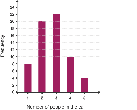
Leon surveys to search out the number of individuals in each of the cars incoming at the college gate between 8.30 am and 9.00 am. His results square measure shown within the chart below:
Questions for you to answer:
a) What percentage of cars contained one person?
b) What percentage of cars contained quite three people?
c) Why are there solely a tiny low variety of cars containing one person?
d) What percentage of cars found out the college gate between 8.30 am and 9.00 am?
Line graphs
A line graph is commonly accustomed to show a trend over a period of days or hours.
It is therefore thought of as a series of points that are then joined with straight lines. The ends of the road graph don't need to be a part of the axes.
This line graph shows the noontide temperature over an amount of seven days:
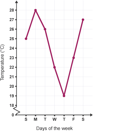
You can tell that the temperature was at its highest on Monday which began to fall in the middle of the week before rising once more at the end of the week.
Questions:
a) What was the all-time low temperature, and on what day did it occur?
b) On what day was the noontide temperature 26 °C?
Pictograms
Pictograms use the footage to represent information. to form a sense, a pictogram should always have a key.
In a pictogram, it's necessary to form a certain image that is the same size, equally spaced out, and lined up one at a lower place the opposite.
| Example |
This pictogram shows the number of pizzas eaten by four friends within the past month:
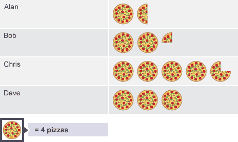
The key tells you that one pizza on the pictogram represents four pizzas eaten, therefore Alan eats 4+2=6 pizzas.
Questions:
a) Who ate the foremost pizzas?
b) What percentage of pizzas did Bob eat?
c) What was the whole variety of pizzas eaten by the four friends?
Pie charts
Pie charts use different-sized sectors of a circle to represent information.
In a chart, it's necessary to grasp that the angle of every sector represents the fraction, out of 360, allotted thereto information price. Pie charts must always be labeled, either directly on the chart or by suggesting that of a color-coded key.
| Example |
This chart shows the results of a survey to search out however students travel to school:
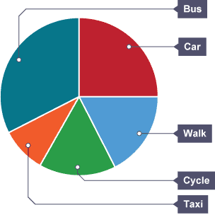
a) What's the most common technique of travel?
b) What fraction of the scholar's travel faculty by car?
c) If half a dozen students travel by car, what percentage of folks took half within the survey?
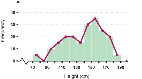
Frequency diagrams and frequency polygons
This frequency diagram shows the heights of 100 people:
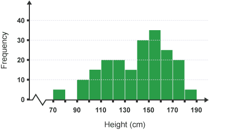
You can construct a frequency plane figure by connecting the midpoints of the super of the bars.
The frequency polygons are significantly helpful for scrutinizing completely different sets of information on an identical diagram.
Scatter diagrams - Plotting and Reading
Scatter diagrams show the link between 2 variables. By looking at the diagram you will see whether or not there is a link between variables. If there is a link it is referred to as correlation.
| Example |
The English and Maths results of 10 classmate's area unit shown within the table below:
| Ria | Kim | Bill | Tom | Gita | Alex | Ben | Ken | Alan | Jo | |
| Maths mark | 20 | 71 | 60 | 52 | 80 | 32 | 47 | 90 | 49 | 80 |
| English mark | 30 | 80 | 65 | 50 | 81 | 38 | 40 | 87 | 55 | 70 |
To see whether or not there is a correlation between the Maths marks and also the English marks, you will plot a scatter diagram.
The Maths mark is on the x-axis. The corresponding English mark is on the y-axis.
Bill's Maths mark was 60. His mark in English was 65, Therefore results from the area unit pictured by the purple purpose at coordinates (60, 65).
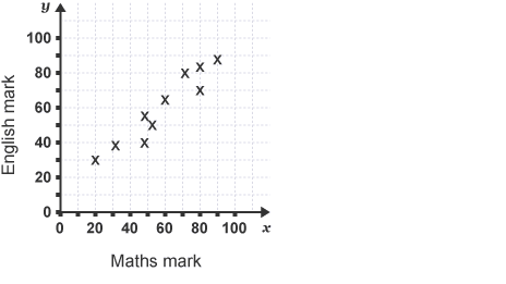
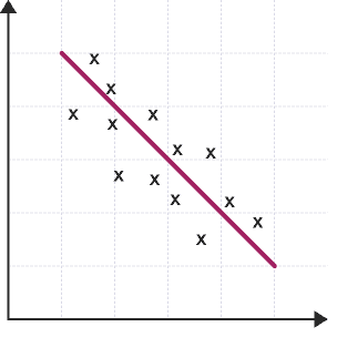
Notice that each one of the points representing Maths marks and English marks lie about on a line. It shows that there is a correlation between these two variables.
The diagrams below show the correlations that you will deduct from different patterns of scattering.
Positive correlation:
The points lie getting ready to a line that contains a positive gradient.
It shows that one variable will increase the other will also increase.
Negative correlation:
- The points lie getting ready to a line that contains a negative gradient.
- It shows that the united variable will increase the opposite decreases.
No correlation:
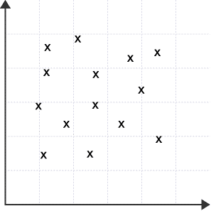
The points do not form any straight line.
It shows that there is no affiliation between these two variables.
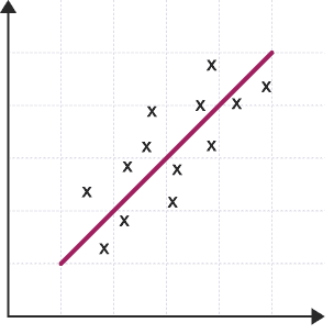
Scatter diagrams - the line of the best match
The line of best fit goes roughly through the center of all the scatter points on a graph. The nearer the points area unit to the road of best match, the stronger the correlation is.
| Example |
Ten pupils in a school study French and German. Their marks in recent tests area unit recorded within the table below:
| Ben | Sara | Sun | Tom | Pari | Henry | Sia | Andy | Jo | Gita | |
| Mark in French | 42 | 62 | 32 | 78 | 70 | 18 | 68 | 52 | 84 | 38 |
| Mark in German | 48 | 56 | 24 | 68 | ? | 22 | 76 | 54 | 89 | 39 |
Draw a scatter diagram to represent these marks, as Pari was absent on the day of the German test. You are doing not have enough data to mark his score.
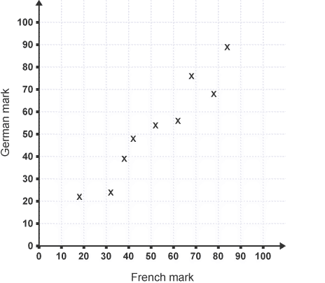
Looking at this scatter diagram,
There are robust correlational statistics between the marks in French and also the marks in German. Therefore, you will draw a line of best suitable shows that trend.
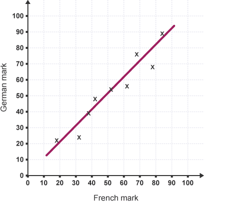
Pete scored seventy in French, therefore victimizing the road of best match, you will estimate that his mark in German would are about 72.
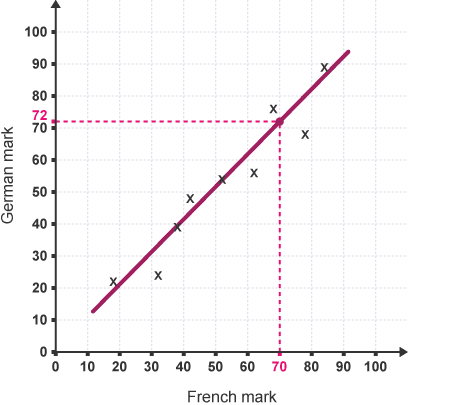
- A line of the best match will solely draw if there is a robust positive neither indirect correlation.
- The line of the best match does not have to undergo the origin.
- The line of the best match shows the trend. It is solely approximate. Any readings taken from it will be estimations.
Summary
Many of us don't find it easy to deal directly with numbers. Many of us simply lose interest if we see numerical figures in a table.
But if you present data using a graph or chart, you create a picturing of the numerical information which makes much more sense than raw numbers.
Trends and proportions become more obvious. It is immediately and shiningly obvious, even for those that struggle with numbers.
So nowadays, representing data with visual images and charts is an important skill of presentation and information passing.
You have to practice the reading of graphs and charts until it comes naturally to you. That's how you will able to find great insights.
Also read,
About Cuemath
Cuemath, student-friendly mathematics and coding platform, conducts regular Online Classes for academics and skill-development, and their Mental Math App, on both iOS and Android, is a one-stop solution for kids to develop multiple skills.
Check out the fee structure for all grades and book a trial class today!
Frequently Asked Questions (FAQs)
What is data?
Data may be a collection of facts, like numbers, words, measurements, observations or simply descriptions of things.
How do you differentiate between data and information?
Data is raw, unorganized facts that require to be processed. Data is often something simple and seemingly random and useless until it's organized. When data is processed, organized, structured, or presented during a given context so as to make it useful, it's called information.
Example: Each student's test score is one piece of knowledge. The typical score of a category or of the whole school is information that will be derived from the given data.
What are the ways to represent data?
There are a variety of ways of representing data diagrammatically. The solution is that you simply should use figures and numbers whenever they provide the simplest evidence to copy your argument or to inform your story.
What are the different types of graphs?
- Line graph
- Bar graph
- Pictograms
- Pie charts
- Frequency diagrams and polygons
- Scatter diagrams
What are the different types of bar graphs?
- Vertical bar graphs
- Horizontal bar graphs
- Straight bar graph
What are the different types of line graphs?
- The following are the kinds of line graphs:
- Simple Line Graph: just one line is plotted on the graph.
- Multiple Line Graph: Only one line is plotted on an equivalent set of axes. A multiple line graph can effectively compare similar items over an equivalent period of your time.
- Compound Line Graph: If information is often subdivided into two or more sorts of data. This sort of line graph is called a compound line graph.
- Lines are drawn to point out the part of a complete. The highest line shows the entire, and the line below shows a part of the whole. The space between every two lines shows the dimensions of every part.