Bar Graph Maker
Bar graphs are valuable tools to plot data that could range from elections in the United States to the impact various storms and hurricanes have had on the country over the past decade or decades.
In this lesson, you will learn about how to use a bar graph maker, and understand the various types of tools such as animated bar graph maker and grouped bar graph maker.
Check out the interactive examples to know more about the lesson and try your hand at solving a few interesting practice questions at the end of the page.
Lesson Plan
What is Bar Graph?
Sia is having a look at the record of the average monthly expenses of two families.
| Expenses (in USD) | Rony | Sam |
| Transport | 150 | 120 |
| Clothing and shoes | 100 | 110 |
| Sports and leisure | 75 | 100 |
| Utilities | 120 | 100 |
| Rent per month | 150 | 120 |
| Restaurants | 75 | 100 |
| Miscellaneous | 105 | 110 |
Looking at the table, it was really difficult for her to notice trends and analyze the data.
So, she converted it into the form of a bar graph.
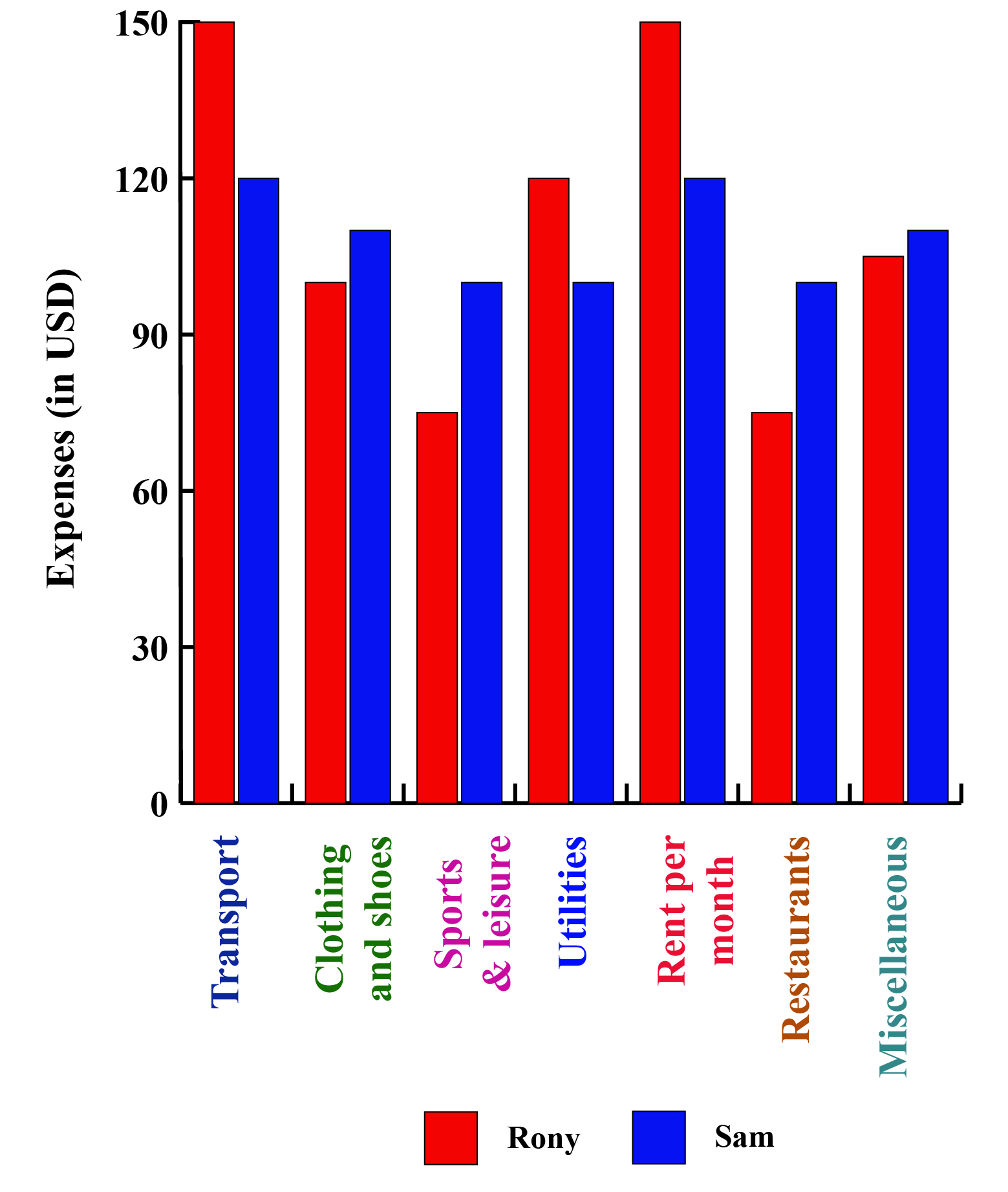
Converting that data into a bar graph, provided Sia with a different and more effective way of looking at the same information.
A bar graph, also called a bar chart, can make it much easier to notice trends that are not as obvious when viewing the raw data or tabular data.
"A bar graph is a representation of numerical data in pictorial form of rectangles (or bars) having uniform width and varying heights."
Bar graphs, also known as column graphs, use vertical or horizontal bars to represent data.
Each bar denotes one value.
When the bars are arranged next to one another, it becomes convenient for the observer to compare different bars, or values, at a glance.
Depending on the situations, different types of bar graphs are used.
What we saw in the above case was a grouped bar graph.
Have a glance at various other types of bar charts.

Creating a Bar Graph
Below are the steps to create a bar graph (also called a bar chart) on a graph paper.
Step1:
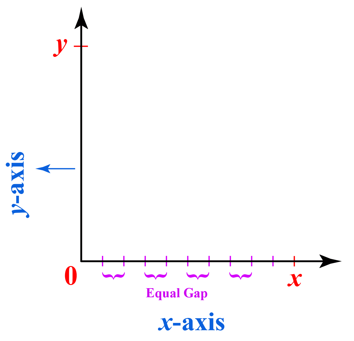
Take a graph paper and draw a horizontal line OX and a vertical line OY.
The horizontal line is called the x-axis and the vertical line is called the y-axis.
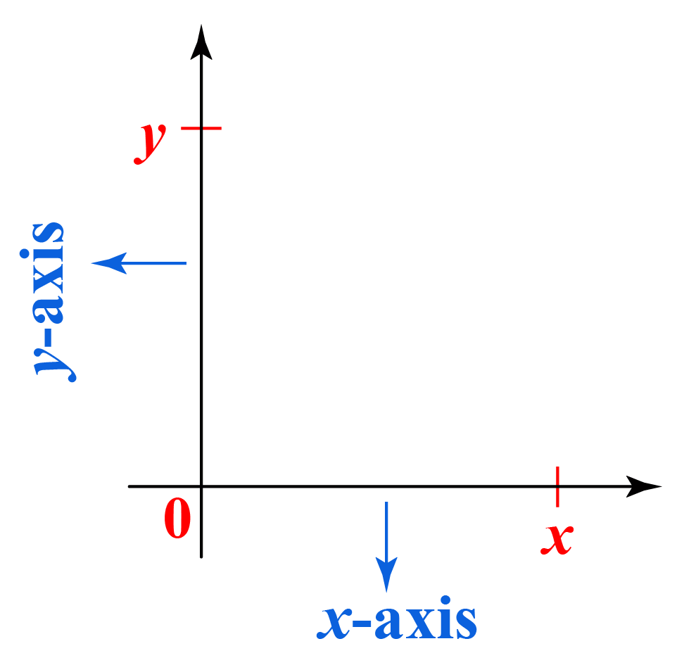
Step2:
Along the x-axis (horizontal), mark the points at equal intervals.
Write the names of the data (independent variables) whose values are to be plotted below the horizontal axis.
Step3:
Choose a suitable scale for values on the y-axis, i.e the dependent variables.
On the vertical bar, determine the height of the bar for the numerical data to be plotted.
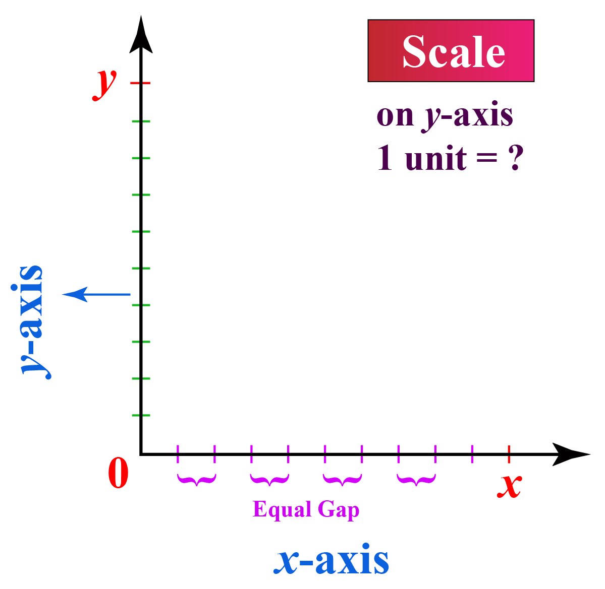
Suppose you choose a scale: On the y-axis 1 unit = 5 lbs.
Now, you want to represent 15 lbs. So, you will divide 15 by 5 i.e. 3
Therefore, 15 lbs are represented by a bar of height 3 units on the graph.
Step4:
On the x-axis, draw columns (or bars) of equal width for the heights calculated in the above step.
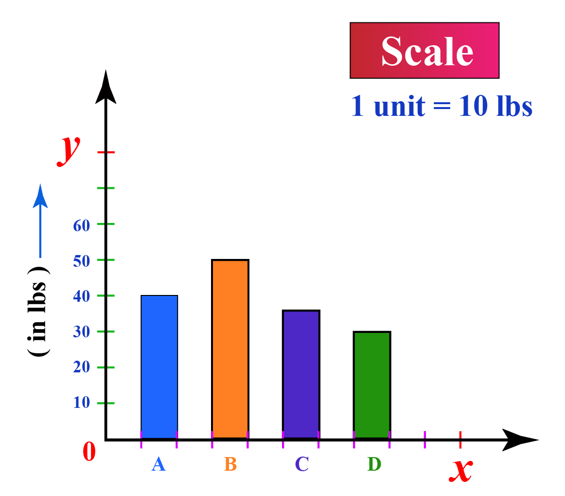
These rectangular columns represent the numerical data of the items given on the x-axis.
Following are the essential components of a bar graph:
1. Data - Relevant to the purpose.
2. Title - Information about data.
3. Labelled axes - X and Y axes.
4. Legend - It helps readers understand what the bars refer to, similar to the one used in the map.
5. Suitable scale - Calculate the range of data to decide that.
Try making a bar graph for the monthly expenses of your family for the past 1 year.

1.Keep equal space between the rectangles (bars).
2.Choose scale wisely. Consider the highest and the lowest numerical value to decide the scale.
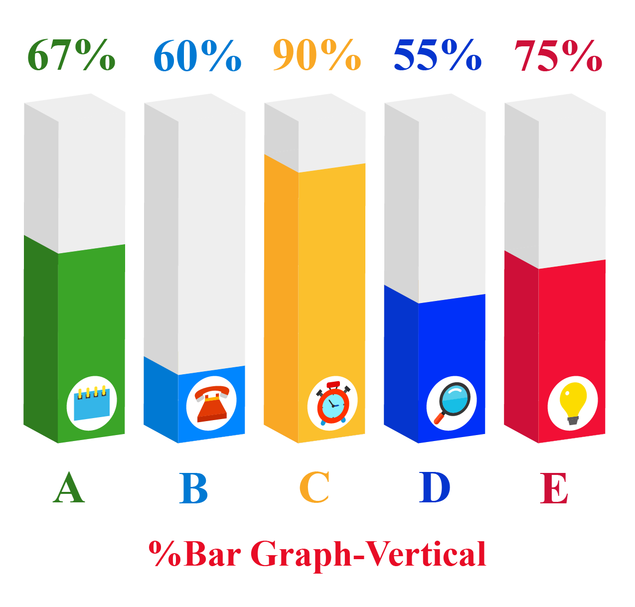
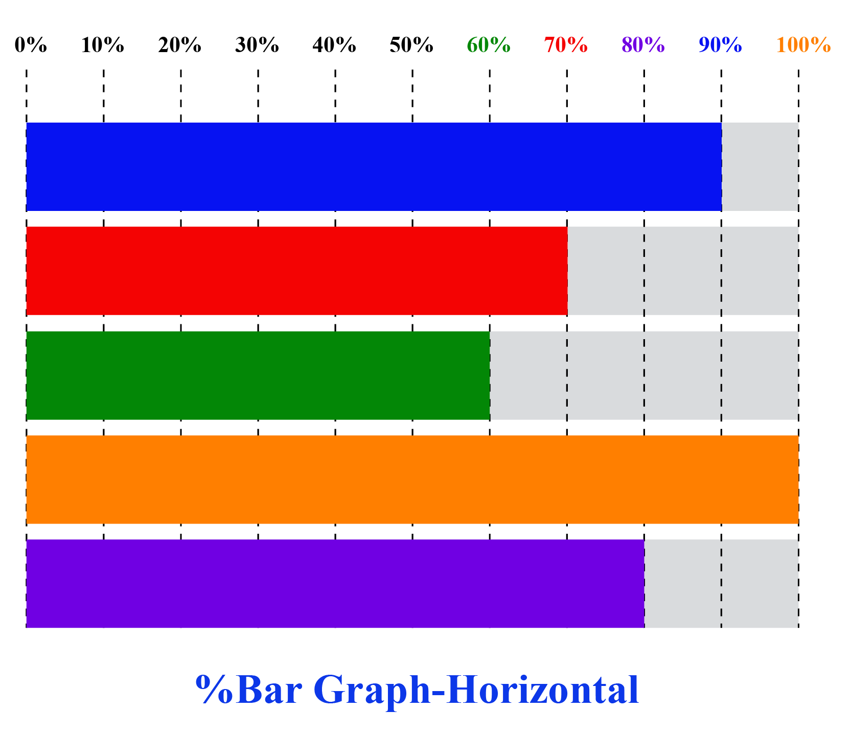
3.Use a percentage bar graph instead of a simple bar graph if you want to analyze your academic performance.
Bar Graph Maker Simulation
After having learned how to make a bar graph, let's dive into creating a bar graph online.
A survey was conducted for students of grade 6 on their favorite sport.
Their responses are recorded in the following table:
| Name of favorite Sport | A | B | C | D |
| Girls | --- | --- | --- | --- |
| Boys | --- | --- | --- | --- |
Let's create a grouped bar graph maker for this record.
Instructions: Input the names of four sports and choose the numerical values for the number of girls and boys who like that particular sport in the columns below using the drag buttons
Hey! Did you finish making your bar graph? Try to analyze it and study the trend.
You may also try creating a Percentage bar graph maker. Input the values and see how it gets converted to a percentage bar graph.
Representing data on a bar graph that would tell a story or give a clear message is also necessary.
Not everyone can do that easily and effectively.
One of the effective ways is to create an animated bar chart.
These types of graphs are very popular, especially in social media, as it provides a holistic data story.
Have a look at the animated bar graph maker for the data given below:
| Name of Person | Weekly Time Spent on Different Social Media Websites (in hours) | |||
| A | B | C | D | |
| Peter | 15 | 24 | 45 | 12 |
| Susan | 14 | 25 | 40 | 20 |
| Sam | 20 | 23 | 50 | 25 |
| Liza | 20 | 20 | 25 | 22 |

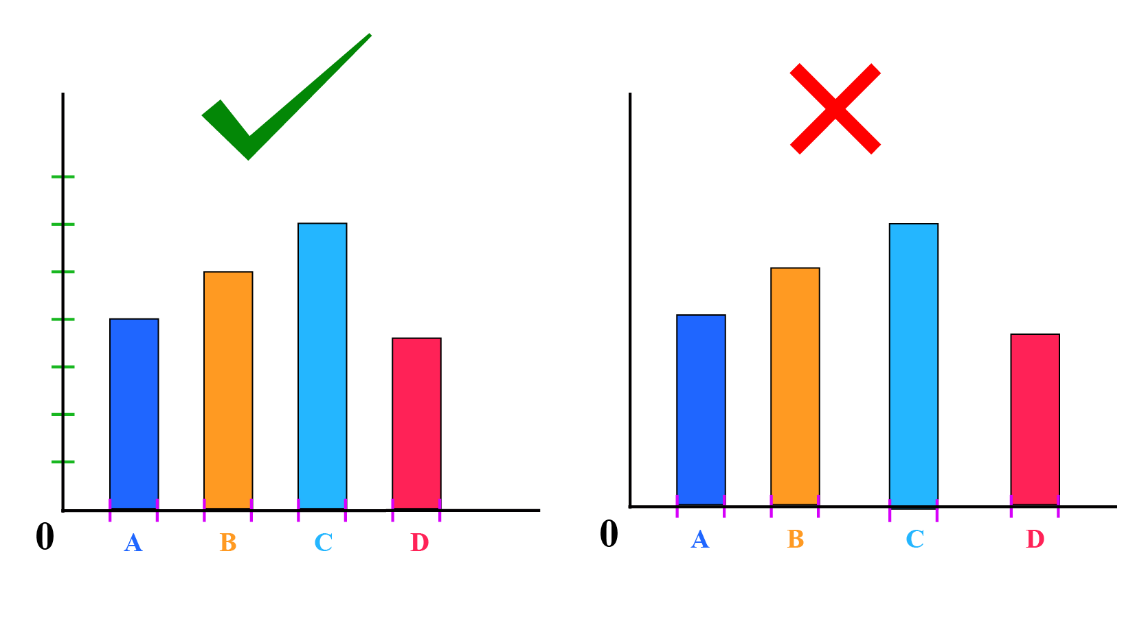
The bar graph below shows the number of subscribers of two competing channels.
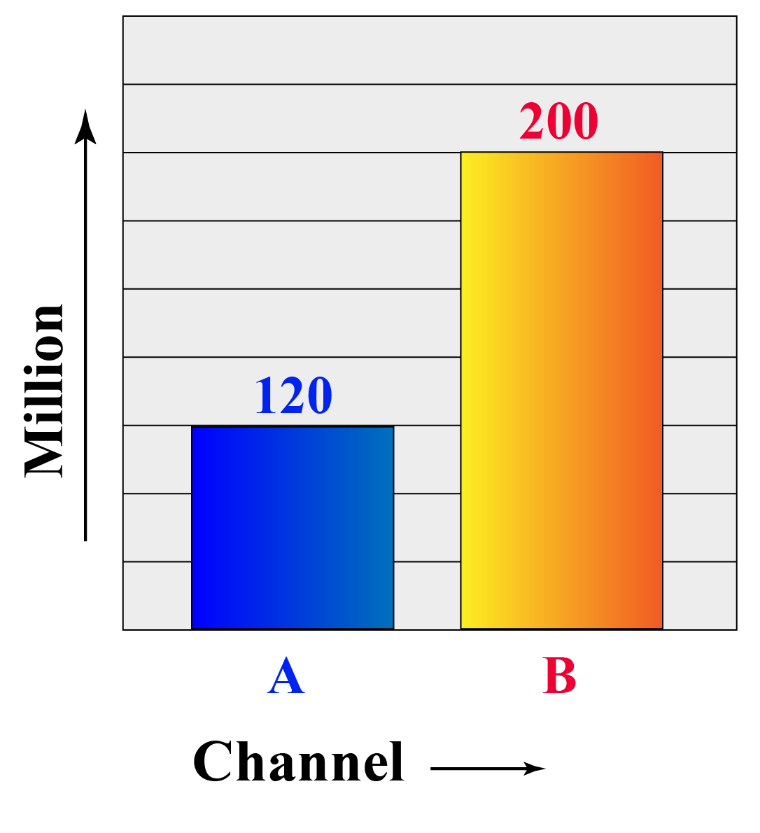
- Can you identify the mistake in plotting the values?
- What are the precautions to be taken while truncating the axis?
Interactive Questions
Here are a few activities for you to practice. Select/Type your answer and click the "Check Answer" button to see the result.
Let's Summarize
We hope you enjoyed learning about Bar Graph Maker with the simulations and practice questions. Now, you will be able to easily solve problems on bar graph maker percentage, grouped bar graph maker, and animated bar graph maker.
About Cuemath
At Cuemath, our team of math experts is dedicated to making learning fun for our favorite readers, the students!
Through an interactive and engaging learning-teaching-learning approach, the teachers explore all angles of a topic.
Be it worksheets, online classes, doubt sessions, or any other form of relation, it’s the logical thinking and smart learning approach that we, at Cuemath, believe in.
Frequently Asked Questions (FAQs)
1. What is the best use of a bar graph?
A bar graph can make it much easier to notice trends that are not as obvious when viewing the raw data or tabular data.
They are used to compare different items and understand change over time.
2. What does a bar graph need?
A bar graph needs a well-defined purpose and relevant data.
3. How do you make a comparative bar graph?
A comparative bar graph can be made by using various methods.
The most common types of bar graphs used for comparing data are: Stacked bar graph, Percentage bar graph, Clustered /Grouped bar graph.
- Live one on one classroom and doubt clearing
- Practice worksheets in and after class for conceptual clarity
- Personalized curriculum to keep up with school